#19: Seven things you didn't know about life expectancy
Life expectancy is being pushed higher. What does this mean, and what does it tell us about the future?
This is my nineteenth post of Scientific Discovery, a newsletter where I’ll share great new scientific research that you may have missed. Check out the About page if you’re interested in why I’m writing this.
I started 2024 by hiccuping for a whole 40 minutes. Happy new year to you too!
New years (and birthdays) used to make me feel anxious about getting older. But nowadays I think getting older isn’t what it used to be.
There are a lot of common misconceptions about life expectancy and longevity, and sometimes I think our intuitions are outdated by many years.
Life expectancy is a complicated topic, but itʼs one that I think is important to understand. So in this post Iʼll take you through the topic with 16 charts.
Several points come from the new Life Expectancy page I worked on at Our World in Data with my great colleague Lucas Rodés-Guirao – check it out if you’re interested in exploring more.
As always, please let me know if you spot any errors – you can earn a reward for it and I’ll really appreciate it. And if you like this post, I hope you subscribe!
1. We tend to live longer than our life expectancy implies
Iʼll start with one thatʼs surprising. Life expectancy isn’t a prediction of how long people will live.
When you hear the phrase life expectancy, it usually refers to ‘period life expectancy at birth’, which is a statistic calculated using data across the population in one single year.
For example, the period life expectancy at birth in France in 2021 was 82.3 years. People usually think this means babies born that year will live an average of 82.3 years.
But hold on… we don’t know what babies born today will experience throughout their lives, or what their death rates will be, compared to previous generations.
What if new medical advances will arrive, or what if they experience major wars or pandemics or other major changes? How do we know what changes we’ll see in the future, or how impactful they will be?
To know for sure, we’d need to wait until nearly everyone in the birth cohort has died – around a century from now – to find out what their average lifespans actually were. This statistic would be called their ‘cohort life expectancy’.
What happens if we compare cohort life expectancy to period life expectancy in people’s birth years? The chart below shows this.
[Side note: I’ve shown data from France in several charts in this post because it has particularly long-term mortality data and a relatively large population.]

Firstly, the chart shows that the blue line (cohort life expectancy) is incomplete – this is because we don’t know how long babies born more recently have lived.
For the most recent year with data – 1930 – you can see that period life expectancy in France was 57 years – but people born in 1930 actually lived for 69 years on average. They lived 12 years longer on average than their period life expectancy implied.
That’s a pretty big difference! What’s going on?
To understand, we’ll have to look at how period life expectancy is calculated: it’s a metric that’s based on death rates in each age group in one particular year.
Imagine death rates in different age groups in the year 2022. The period life expectancy in 2022 tells us the average lifespan of a hypothetical group of people, if they experienced the same death rates at each age of their lives, as the death rates seen in 2022 at each corresponding age group.
So, according to the hypothetical, babies born today would experience the same death rates when they’re aged 50 as the death rates seen in 50-year-olds this year.
Now you can understand why this differs from their actual average lifespans. Death rates have been declining over time, and people have faced lower death rates than older generations have when they’ve reached the same ages. You can see this below.

One reason why we’d expect the divergence between period and cohort life expectancy to continue is that even death rates seen today are partly a reflection of the past.
Death rates today are partly a result of the health conditions that people alive today have developed in earlier years – because of their environment, living standards, healthcare, behaviours and so on, which they experienced before.
If you’re more interested in more, I’ve written an article about it: Period versus cohort measures: What’s the difference?
This doesn’t mean period life expectancy isn’t useful – it’s still an important condensed statistic that summarizes mortality patterns in a population in a given year. This helps to compare populations across countries and over time. But understanding its details will help ensure you understand its implications correctly.
2. The annual risk of death has declined across age groups
At each age of our lives, we have lower risks of dying than the generations before us. Let me show you this with a couple of charts.
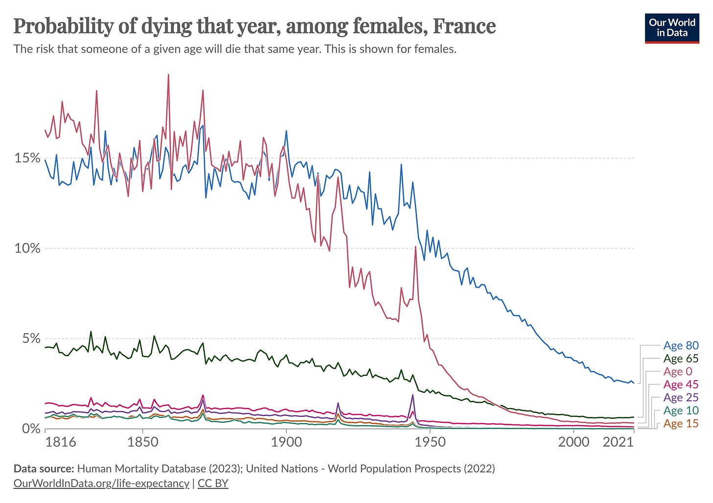
The first chart below shows the annual probability of death in people of different ages in France.

Babies had a 15% probability of death during infancy in France in the 19th century. Now, the probability is 0.3%.
65 year olds had around a 4% probability of death at that age in the 19th century. Now it’s around 0.7%. Eighty year olds’ probability of death has declined greatly as well – from around 15% in the 19th century to around 2.7% now.
It hadn’t fully sunk in before I saw this chart that infants used to have the same annual probability of death as 80 year olds.
In the chart below, I’ve shown this in a different format, so you can see it across the lifespan.
Each line shows death rates in a birth cohort when they reach different ages. Death rates are expressed as a percentage, and the chart is on a log scale. The different lines show different birth cohorts: dark red for people born in the 1800s, green shows those born in the 1900s, and dark blue shows those born in the 1980s.
As you can see, infants and the elderly have higher death rates. Death rates drop quickly after infancy, then rise in youth, and then rise exponentially with age in adulthood.
But you can also see that, across birth cohorts, the whole curve has shifted downwards. The decline is large – it’s shown on a log scale. Each age of our lives is less deadly than it was for previous generations.
If you’re interested in more, I’ve written an article about it: How does the risk of death change as we age – and how has this changed over time?
The declines we see in old-age mortality are likely an understatement of how much has improved. This is because child mortality rates have declined especially among poorer demographics, who would have lower-than-average survival even after childhood. As more of them survive in the population, you might actually expect average mortality rates at older ages to increase if there had been no other improvements. Instead, they continue to fall – which suggests large improvements that aren’t ‘cancelled out’ by this effect.
3. Life expectancy is about gains across age groups – but declines in child mortality now make smaller contributions to overall gains
Life expectancy at birth is a condensed summary of death rates across all age groups. But we can also look at life expectancy in adulthood – that is, for people who have already survived to adulthood. These are based only on death rates at older ages.
As the chart below shows, 65 year olds in France for example used to have a life expectancy of around 76 years before the 20th century. But now their life expectancy is around 86 years.
You saw the reason for this in the previous charts – death rates have declined greatly even at older ages.
The decline in older-age mortality has become a major driver for gains in life expectancy at birth in wealthier countries, in recent decades.
And, in the previous section, you also saw that child mortality rates have been reduced greatly.
Because child mortality rates are now at much lower levels, further declines make smaller contributions to overall gains in life expectancy, especially in wealthy countries.
You can see this in the chart below, which comes from a study by José Manuel Aburto et al. (2020). The data comes from 49 countries in the Human Mortality Database, which generally includes higher-income countries.
The chart shows how much life expectancy would increase (expressed as a weight, on the y-axis) if lives were saved at a particular age (x-axis). This is shown for different time periods (coloured lines).

In the words of the authors:
From the 18th to the first part of 20th century, the largest potential increases in life expectancy were concentrated in infancy. The effect on life expectancy improvements due to saving lives in midlife was higher than at older ages. This changed dramatically after 1950, when the effect of infant mortality decreased significantly. By 2010, the effect of reducing mortality by 1% at birth was the same as reducing mortality by 1% at age 71. In the 21st century, saving lives between ages 5 and 40 y had a negligible effect on life expectancy, as opposed to the relatively high impact of these ages before 1900.
At the same time, infant and child mortality continue to play a major role in poorer countries.
What’s tragic about this is that they tend to result from causes of death that are easily avertable with public health efforts – malnutrition, sepsis, pneumonia, malaria and HIV/AIDS – and that are now seen as diseases of the past in wealthier countries.
4. Death rates have declined from cardiovascular diseases and cancers
In recent decades, we’ve seen more improvement at older ages than many people realise. Cardiovascular diseases, cancers, infections and a range of other causes are becoming less deadly.
In the chart below, you can see the age-standardized death rate from different causes in the United States.
‘Age-standardized’ means that we’re looking at death rates among people of the same age, i.e. adjusted for population aging. This is important because it helps to make a fair comparison across time and between countries – for example, to understand how much things have changed for fifty-year-olds now compared to fifty-year-olds in the 1950s.
You can see that there’s been a large decline in cardiovascular diseases and cancers since the 1950s. Cardiovascular diseases used to kill more than 500 per 100,000 people annually. Now they kill less than 150 per 100,000 – a decline of around three-quarters.
And cancer death rates have declined by around a third since their peak in the 1990s.
A significant driver of both these large reductions has been the dramatic decline in smoking, which had increased the rates of cardiovascular diseases and a range of cancers.
Cardiovascular diseases seem to rise and fall earlier than cancers. This is because smoking increases the risks of cardiovascular diseases faster than it leads to cancer, and because smoking cessation alleviates the risk of cardiovascular diseases faster than it alleviates the risk of cancers.
Even aside from smoking, there have been a wide range of other medical and public health efforts that have helped reduce mortality from cardiovascular diseases and cancers further.
If we just focus on cardiovascular technology, consider what we have now that didn’t exist a hundred years ago:
Cholesterol-lowering and blood pressure-lowering drugs (e.g. statins, calcium channel blockers, beta blockers, ACE inhibitors, SGLT2 inhibitors, PCSK9 inhibitors, angiotensin receptor blockers)
Surgical techniques (e.g. stents, angioplasty, coronary artery bypass grafts)
Tests and monitoring devices (e.g. echocardiograms, coronary angiographies, at-home blood pressure monitoring and cholesterol testing kits)
Medical devices (e.g. defibrillators and pacemakers)
Some of these – such as SGLT2 inhibitors and PCSK9 inhibitors – only arrived in the last decade.
Even with this, I think developing these technologies has just been the beginning – we’ve not only needed to discover how to save lives, but we’ve also needed to find ways to improve and scale them up so more people can benefit from them.
The lack of these technologies are some of the reasons why cardiovascular mortality tends to be higher in poorer countries.
In the chart above, you’ll have also noticed that not all of the trends have been positive. In the US, opioid deaths have been rising greatly (shown under ‘neuropsychiatric conditions and drug use disorders’). Additionally, the rate of decline of cardiovascular mortality has slowed to a halt in the US, with growing risks from obesity and poor diet. The sudden rise at the end shows the rise in respiratory infection death rates (from Covid-19).
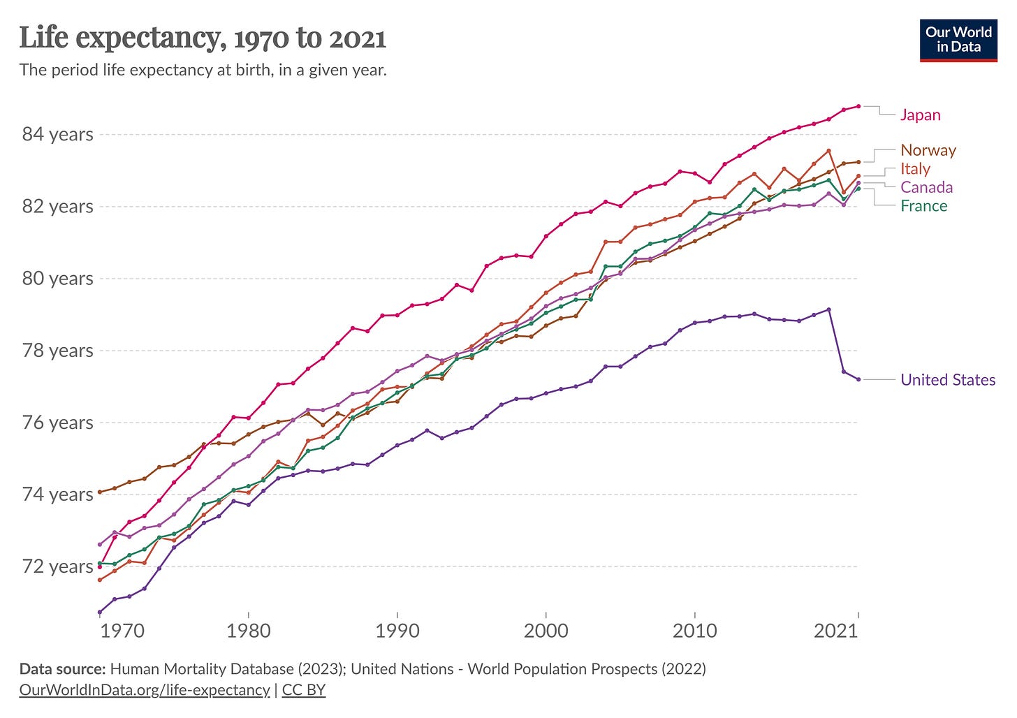
This is part of why life expectancy in the US has stagnated over the past decade, while it continues to rise in other countries.
5. Women tend to live longer than men because of lower death rates across their lives…
If we look at a global average, women have a life expectancy that’s around 5 years higher than men.
It’s a common misconception that this gap is because men are more likely to face risks from accidents and violent deaths.
But women actually tend to live longer than men because they have lower death rates across their lifespans, which you can see in the chart below.
In infancy, boys have higher death rates than girls, mainly because of a higher vulnerability to diseases and genetic disorders. In youth, boys tend to have a higher death rate due to violence and accidents. In adulthood and old age, they continue to have higher death rates due to these factors, occupational risks, and chronic health conditions, partly from higher rates of smoking, alcohol, and drug use.
… but the sex gap in life expectancy isn’t a constant – it varies around the world and has changed over time.
Since the gap in life expectancy results from a wide range of causes, it also varies across the world in different ways. You can see this in the map below.
The sex gap in life expectancy varies widely between countries.
The gap is highest in Russia, Eastern European countries, and South American countries, and lowest in West African countries, India, Scandinavia and New Zealand.
[Until recently, in India, Pakistan, Iran and Bangladesh for example, men actually had a higher life expectancy than women. In India, a major contributor to this was higher rates of female infanticide and childhood neglect. In Bangladesh, it came from higher death rates in women than men, in adulthood, through large gender disparities.]
The sex gap in life expectancy has also changed over time, as you can see in the chart below.
The gap spiked in many countries during the two World Wars, reflecting the surge in deaths especially in young men. But it also grew gradually over the twentieth century and has since been declining. A major part of this was due to the rise and fall in smoking, particularly among men.
Overall, the sex gap in life expectancy isn’t a constant, and breaking it down to understand it better can help us find more ways to prevent avoidable deaths.
If you’re interested in more, I wrote about the sex gap in life expectancy in this article: Why do women live longer than men?
6. Lifespan inequality has been falling
In the same way as economists calculate economic inequality with the ‘Gini coefficient’, you can use it to measure the inequality in lifespans too.
To calculate it, you might start by picking two random people in the population and comparing their estimated ages at death. Then, you do this for the rest of the sample, by looking at the estimated age differences for all combinations of pairs in the population, and normalize the total to a unit between 0 and 1.
From this calculation, you can see that lifespan inequality has declined over time in many countries. Lifespan inequality tends to be lower in richer countries.
(The rise in the 1980s–2000s in Kenya is from the HIV/AIDS epidemic.)
Why is lifespan inequality falling?
Let’s slow down to understand why.
If mortality declines at ages younger than some threshold, then more people survive to an older age, and lifespan variation declines. But if mortality declines at ages older than some threshold, then lifespan variation increases.1 The balance between these two determines how lifespan inequality changes over time.
In a recent study, the authors look into this hypothetical using data from Sweden. You can see it in the chart below. This time we’re looking at the inverse (lifespan equality, rather than inequality).
The purple line shows a scenario of how lifespan equality would change if mortality reductions were focused on younger ages.2 The red line a scenario of shows how lifespan equality would change if there were equal reductions in mortality across all age groups.
Finally, the blue line shows what has actually been observed in Sweden over time. You can see that it lies in between the two scenarios. This shows us that lifespan inequality has fallen because of mortality declines in different age groups – but younger ages have seen greater declines in mortality, and the mortality decline hasn’t been equal across all age groups.

7. The limits of life expectancy are being pushed higher
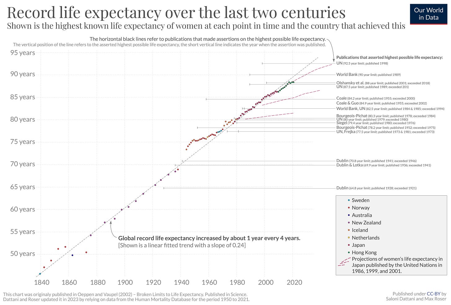
In 2021, Hong Kong was the country with the highest recorded female life expectancy: of 88 years.
That was a whole 40 years higher than the highest country in 1840 – in Sweden, which had a female life expectancy of around 46 years.
This statistic – the highest female life expectancy achieved by any country – has risen over time, which you can see in the chart below. The coloured dots represent the countries that achieved the highest female life expectancy each year.
You can see that the highest life expectancy has risen by approximately 1 year every 4 years.
The horizontal lines on the right-hand side of this chart show a list of predictions – they’re predictions of the maximum possible life expectancy a country could achieve.
The American statisticians Dublin and Lotka predicted in 1936 that the maximum possible life expectancy would be 70 years. That was broken in 1941. Later, in 1979, the UN predicted that the maximum possible life expectancy would be 80 years. Their prediction was broken the next year by Iceland. Many other predictions have already been broken, as life expectancy has continued to rise.
You can also see that Sweden, Norway, Iceland, Denmark and the Netherlands held the record in many years in the past. But in recent decades, Japan and Hong Kong have pulled ahead.
Notice that it’s not the case that they’ve merely caught up – they’ve continued to push the limits higher; they’re breaking their own records.
If you’re interested in more, the chart originally comes from a famous paper by Jim Oeppen and James W Vaupel in 2002, which you can read here.
Below is a view of the trends in each of these countries over time.
What’s the message to take away from all of this?
To me, one of them is that longevity isn’t one obscure problem that needs to be ‘cracked’ in order for us to live longer. We’ve been able to reduce mortality and delay death by continuously working on a wide range of problems.
Disease outbreaks that used to be a constant – measles, typhoid, diphtheria, cholera, and even bubonic plague – are now much less common and less deadly in many countries. Mortality rates from cardiovascular diseases, chronic respiratory diseases and cancers – some of the biggest causes of death – have been reduced.
Another point is that we can live longer by reducing premature mortality and expanding the frontier. Worldwide, there’s still so much left to be done. Even now, life expectancy in Nigeria and Chad, for example, is just 53 years. That’s thirty years lower than it is in South Korea or Japan – but they had faced that same life expectancy in just the 1950s.
None of these trends are a given.
We might face new unexpected problems in the future, as we’ve faced so far. In recent history, the world has seen a dramatic rise in smoking, and major events like the World Wars and the AIDS epidemic have each caused huge surges in deaths at different times.
And we continue to face old challenges. Diseases like Alzheimer’s and dementias are still notoriously difficult to treat. Antimicrobial resistance threatens to reverse our ability to treat common infectious diseases. Many diseases that seem solved still require lifelong treatments that carry long-term side effects.
But that doesn’t mean we can’t make progress against them too, and I think it’s up to our own efforts to get there.
What I’ve been up to
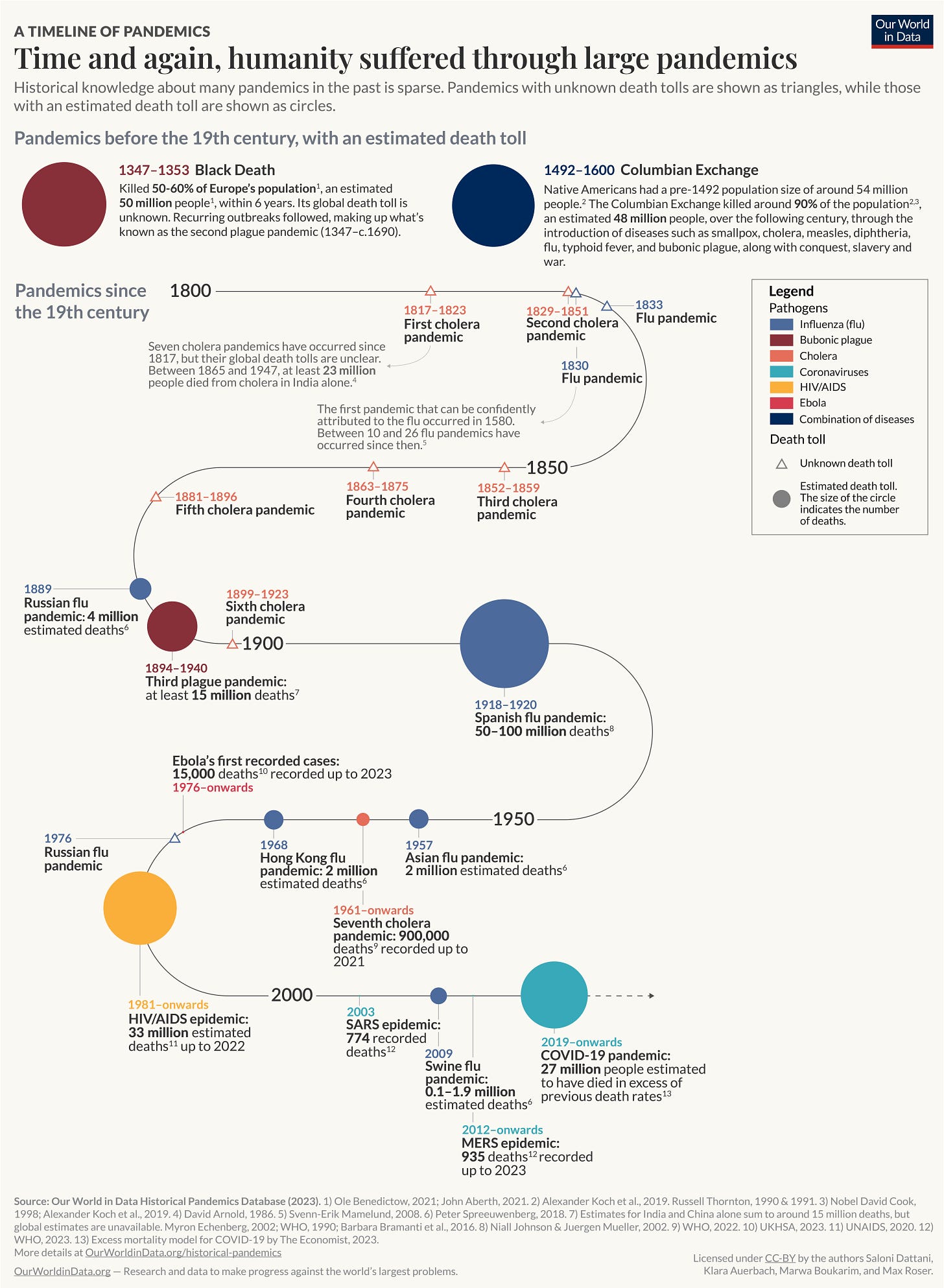
I wrote a big new article: ‘What were the death tolls from pandemics in history?’ It includes this big chart!
I also worked on several new topics with my wonderful colleagues at Our World in Data, such as tuberculosis, cardiovascular diseases, and pandemics.
I recorded an audio version of my coauthored article ‘Why we didn’t get a malaria vaccine sooner’, after people requested it. You can listen & download here:
I got DALL-E to create a little avatar for me. It’s a me, Salonio.
And… that’s all for now! If you liked this, I hope you’ve subscribed & shared it with your friends. (And if you’ve spotted any errors, please let me know and you could earn a reward.)
I once again have a big pile of new research that I want to share, so hopefully you’ll have another research round up in your inbox soon.
See you next time! :)
– Saloni
Thanks very much to my friend Nathaniel Bechhofer for feedback on a draft of this post.
In other words, mortality has declined across age groups, but only declines at ages below a threshold will reduce lifespan inequality. Declines at ages above it will increase inequality.
Young ages here don’t necessarily mean childhood – they refer to the youngest ages when deaths still occur to achieve the life expectancy of the following year.


Fantastic piece, thank you! I think we don't have a good understanding of these long-term slow demographic change in policy terms, and how they will alter our social world over time. We're only very slowly adapting pension and healthcare systems, for example.
Is it possible to have a follow-up looking at the related concepts of Healthy Life Expectancy or Disability Free Life Expectancy - whether the increase in life expectancy flows straight through into needs for social or health care, or whether the period needing such care changes little, while healthy life is where the increase is? This does inform people about decisions on retirement ages, for example.