#15: What does it mean when fewer people die?
This week: Different angles on the decline in mortality, clean water, easy ways to save lives, and more.
This is my fifteenth post of Scientific Discovery, a newsletter where I’ll share great new scientific research that you may have missed.
Hello! It’s been a while because I’ve been pretty busy at my new job at Our World in Data. But I’ve also been reading lots of great research, and I’ve tried to summarise some of it here.
If you like this, I hope you subscribe. And if you spot any errors, please let me know so I can fix them. (By the way, this post is too long for email, so it might cut off later on.)
Children who died & the people who survived them
Max Roser has a great new post on the decline of child mortality, which I found very inspiring. It explains that until around two hundred years ago, around 1 in 2 children died before they were 15 years old.
Even in 1950, around 27% of children worldwide died by that age.
I think tragic statistics can often be difficult to actually absorb. It’s often easier to think of big numbers as something abstract and distant. It’s also common to think about the effects they’ve had at the broader level of population statistics, rather than the actual people involved.
But each of these children had an impact on people’s lives, many of whom are still alive today.
How many children lost a sibling? How many parents lost a child? How many people lost both – at different times in their lives?
Two new studies look at these questions, using data from the Demographic and Health Survey (DHS) Program, which has conducted very large surveys on child mortality in many low- and middle-income countries over decades.
The authors found that in the 1960s, over 50% of women lost a child or a sibling before they were five years old, on average in these countries.
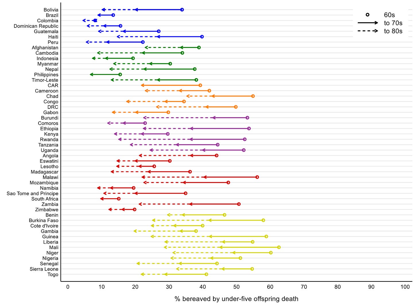
In the 1960s, in Latin American countries, 21% lost a child under five and 35% lost a sibling under five.
In South Asian countries, 22% lost a child under five and 21% lost a sibling under five.
In Western African countries, 50% lost a child under five and 34% lost a sibling under five. This means every other woman surveyed had lost a child under five years old; and one in three had lost a sibling under five.
Many lost both. In total, between 20–40% of women surveyed had lost a sibling and a child under five in most low- and middle-income countries, in the 1960s.
Losing a sibling was related to having a higher risk of losing a child, as you can see in the chart below.
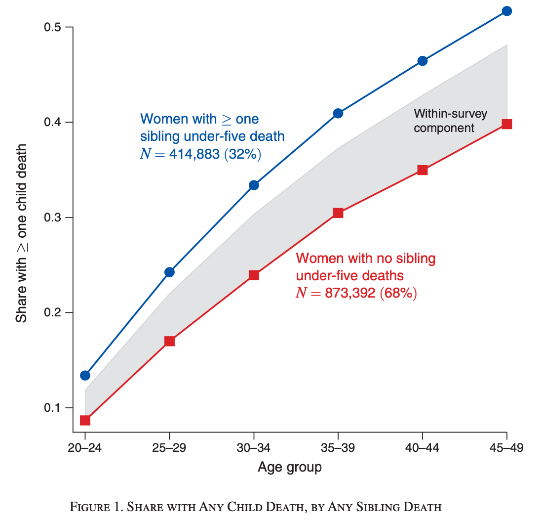
Women who had lost a sibling under five years old were around 40% more likely to lose a child later on. In other words, disadvantaged families in one generation tended to be the families at a disadvantage in the next generation as well.1
But look back at how the first chart shows a decline over time, as well.
Globally, 27% of children died before they were 15 years old in 1950.
But that figure became 4.3% in 2020, which is a 6-fold decline in seventy years. For some wealthy countries, the decline has been more than 100-fold over a couple hundred years.
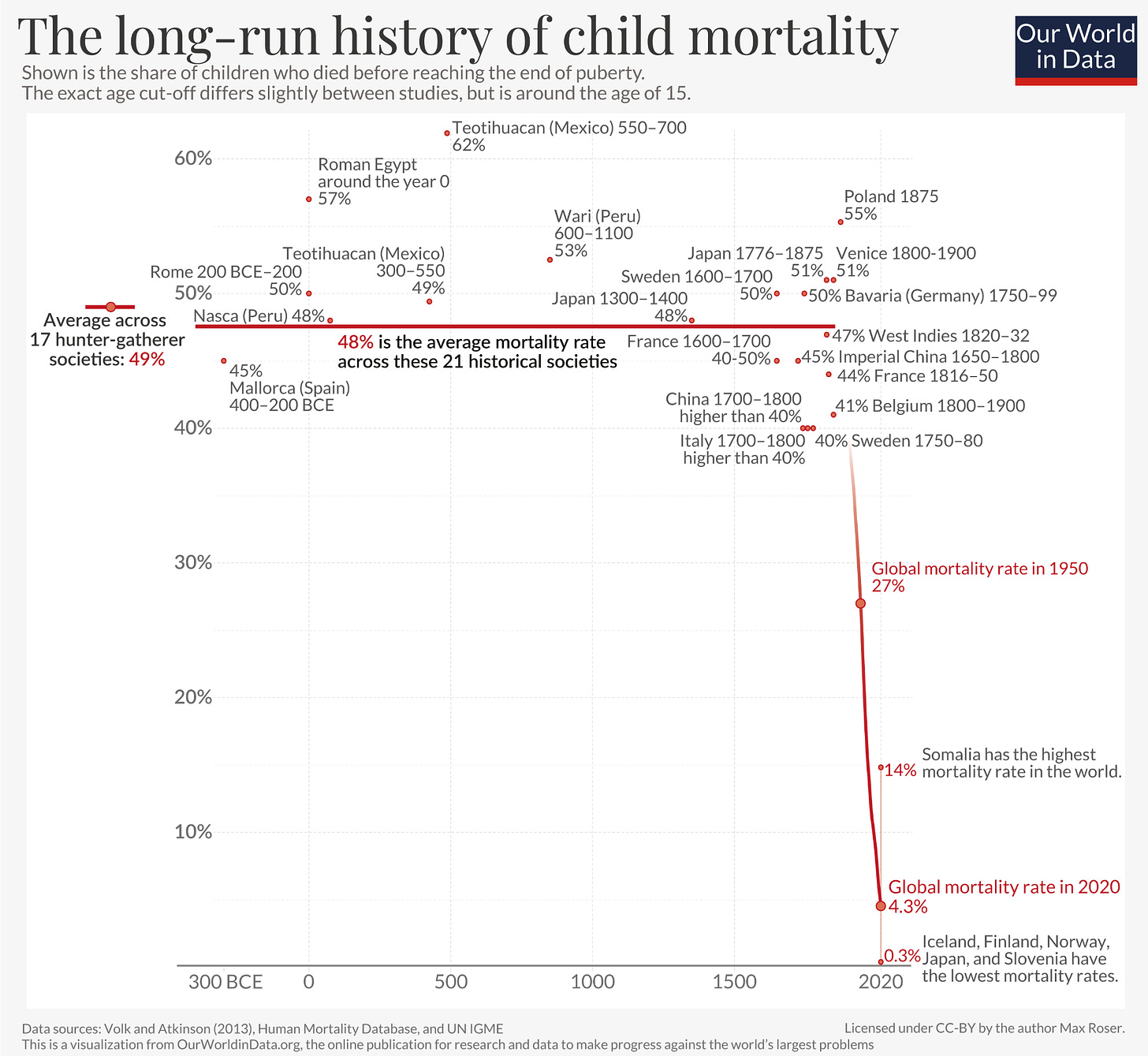
This experience and the even-lower rates in rich countries today, are why we know the global average can be driven down much further. I think we don’t have to imagine what a future could look like without this immense loss. We can already see that it’s possible.
The survival of a cohort
I want to show you another visualisation that helped me understand how these changes have permeated across the population.
It comes from researchers who used data from the Human Mortality Database (HMD), which has national mortality data from many high-income countries.
The authors show the survival of people relative to others who were born the same year.
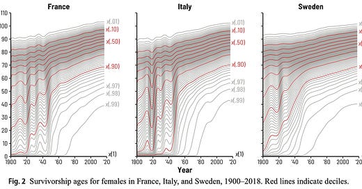
This chart looks complicated but there are so many fascinating things about it, so I’ve tried to break it down underneath, focusing on the data from France.
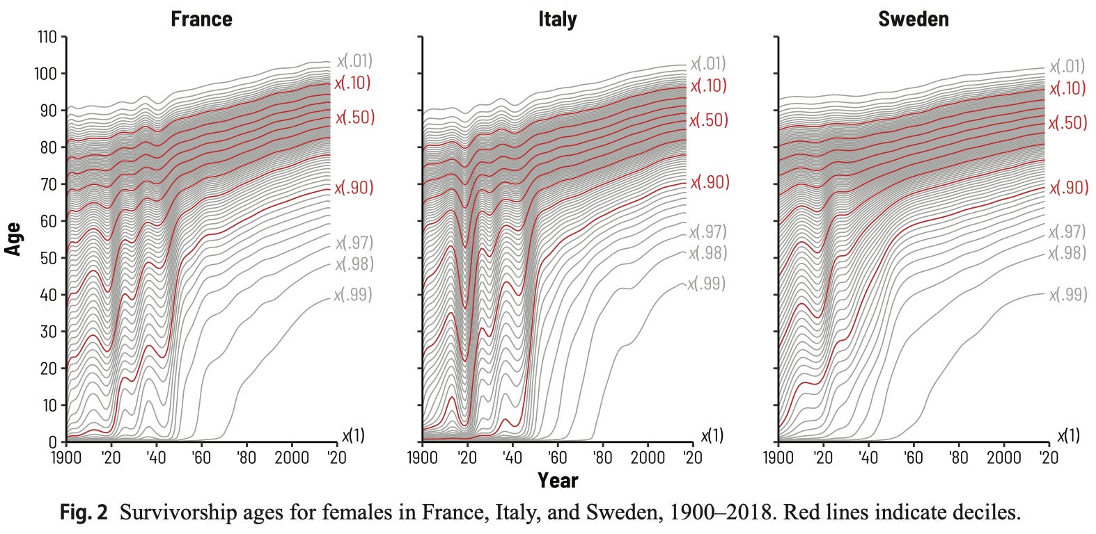
The survivorship estimates are ‘period measures’: they estimate how long people would survive if they experienced the corresponding death rates throughout their whole lives as those seen in each age group in that particular year. (This has been corrected.)2
x(.01): At the top of the chart, you can see the top-percentile x(.01), which is the longest-lived percentage of women. It shows that among those born in 1900, women in France who die at the age of 90 would be in the top 1% of survivors. But among those born in 2018, they would only be in the top 40%. Now, the top 1% are those who would die over the age of 100.
x(.50): Women born in 1900, who would die at the age of 60, would be the median survivors of their cohort. But by 2018, the median survivor would die in their mid-80s.
x(.90): In 1900, 90% of newborns would survive at least until the age of 2 in France and the age of 5 in Sweden. The survival of the 90th percentile was lifted up several times over the century, in particular during the mid-1940s, like the survival of many other percentiles around them. For those born in 2018, 90% would survive at least until their mid-60s.
x(.99): At the lowest end are those who would die before 99% of their peers. In 1900, they would die in infancy, which means 99% would survive only at least a few months of age. But in the mid-to-late-twentieth century, their survival would be suddenly lifted up. By 2018, 99% would survive until almost the age of 40.
The study has many other fascinating insights as well, but the reason I’ve highlighted it is because it tells us something else important too.
It tells us that people nowadays have many more of their friends and peers alive with them as they age.
So here is a different way to describe this chart.
30 year olds born in 1900 France would have 74% of their birth cohort still alive with them. 30 year olds born in 2018 would have over 99% still alive with them.
80 year olds born in 1900 France would have only 10% of their birth cohort still alive with them. 80 year olds born in 2018 would have 75% still alive with them.
What does it mean when fewer people die?
There’s a tendency to see statistics on big topics like mortality as just numbers, and treat them as being separate from stories of people. We struggle to make sense of very large numbers because we don’t know how they relate to us as individuals.
It’s easy to forget that these statistics are distilling something shared about the lives and experiences of billions of people.
By looking at them from different angles like this – the different ways people experience them, and all the people they affect – maybe we can begin to understand what they mean.
This time, we’re all part of the story – it’s about all of us, our parents, grandparents, children and friends, and families we’ve never met. It means fewer parents lose their children, fewer children lose their siblings, and we grow old with more of our friends still alive.
What explains the massive changes we’ve seen in survival across the population?
Of course, the list is long – with factors like nutrition, clean water and sanitation, neonatal healthcare, vaccinations, medicines, reductions in conflicts and famine, and many others, playing major roles at different times.
Something often overlooked is that, even as people age, the health advantages they’ve already had then carry forward – because they reduce the chances of developing comorbidities that would make them vulnerable to new problems later on.
Below, I’ll focus on one of the major factors: clean water, and explain how it’s an easy way to reduce sickness and save lives.
Why does clean water matter?
Contaminated water can contain pathogens like rotavirus, cholera, adenovirus, E. coli and shigella, which cause diarrheal diseases. Or in tropical regions, it can contain parasitic worms that cause schistosomiasis, Guinea worm disease3, trachoma, among others.
All of these waterborne diseases are much more common in countries without safe drinking water and sewage, and diarrheal diseases in particular are one of the top most common causes of death in children worldwide.
Take a look at the scale on the map below. Across age groups, diarrheal deaths are about 50 times more common in low-income countries than high-income countries, on average.
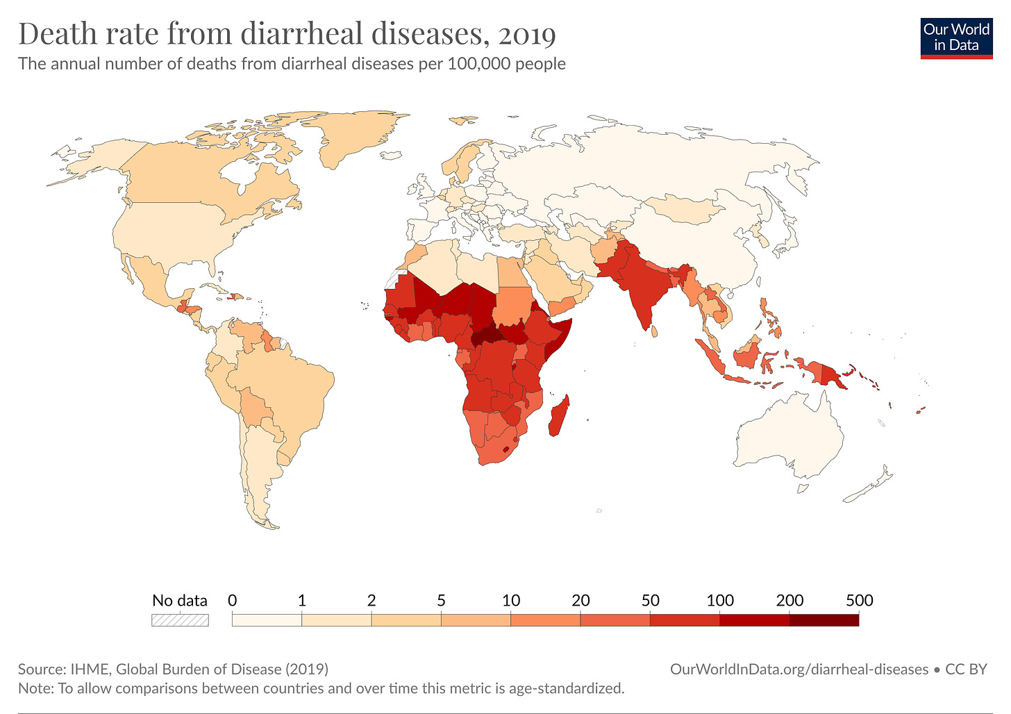
This is noteworthy because we know from research how to prevent so many of them with tools like rotavirus vaccines, oral rehydration therapy, cholera vaccines, sanitation and clean water.
There are many simple and effective treatments to clean water – such as chlorination, water filtration, and solar disinfection. These can kill pathogens in drinking water.
What’s less obvious though is how effective they are, and how much of a difference they make. To answer these questions, a good source of evidence are randomized controlled trials.
Recently, a large RCT in Malawi tested out a clean water program: a random selection of households were given free coupons, which they could swap for chlorination solution at local shops, to add to their drinking water.
The trial was conducted over a period of 18 months with over 2,300 households.
In the chart, you can see that the chlorination coupon program reduced children’s diseases by around 21% over the next six months, compared to the control.
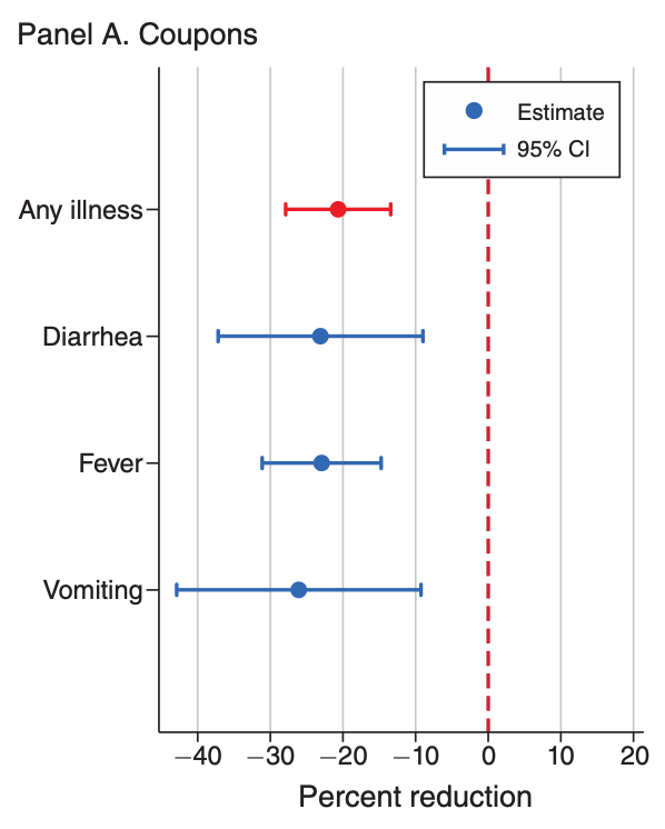
This is a big reduction. But note that I’ve said the chlorination coupon program reduced children’s diseases, not chlorination. This is an important distinction.
The result is an average across all the households in the group. The authors found that only 20–40% of households were actually using the chlorination treatment at intervals in the study.4
So, this doesn’t directly answer how effective chlorination is in reducing disease. It answers how effective the chlorination coupon program was.
If you focused on the households that consistently used chlorination, you would see they had an even larger reduction in disease. But that may not be the relevant question.
When researchers test out ideas and treatments like this, they often want to test how effective the actual program would be, if it was implemented in the real world.
This is one reason researchers use what’s called ‘intention-to-treat’ analysis56, which is when they compare the groups based on what they were allocated to receive, not what they actually received.
It also reminds us that other programs can have different effect sizes. For example, if there were piped clean water systems installed (so people didn’t have to remember to add chlorination solution regularly), I’d expect the benefits to be greater.7
To put this trial into perspective, let’s look at other trials for clean water treatments.
Clean water treatments, at scale
The authors of a big recent meta-analysis looked at clean water treatment programs and their effects on child mortality across RCTs in 21 countries.
In each trial, randomly-selected households or villages were given clean water treatments (e.g. chlorination, water filtration or spring protection). These were given through chlorine dispensers, coupons, solution, or filtration devices.
The trials took place in countries including Bangladesh, India, Pakistan, Uzbekistan, Kenya, Malawi8, Rwanda, the Democratic Republic of Congo, Zimbabwe, Zambia, Guatemala and Bolivia, all between 1998 and 2021.
It’s usually difficult for a single study to see the effect that something could have on reducing mortality.
This is because deaths within a study tend to be rare to begin with. So trying to identify a reduction in deaths, starting from a small number, is tricky, and the effect sizes can be unstable. But with a very large study or meta-analysis9, identifying the effect becomes possible.
By pooling the data from all these trials, the authors estimated that clean water treatment programs reduced mortality by around 30% in children under five years old, across trials. You can see this below.
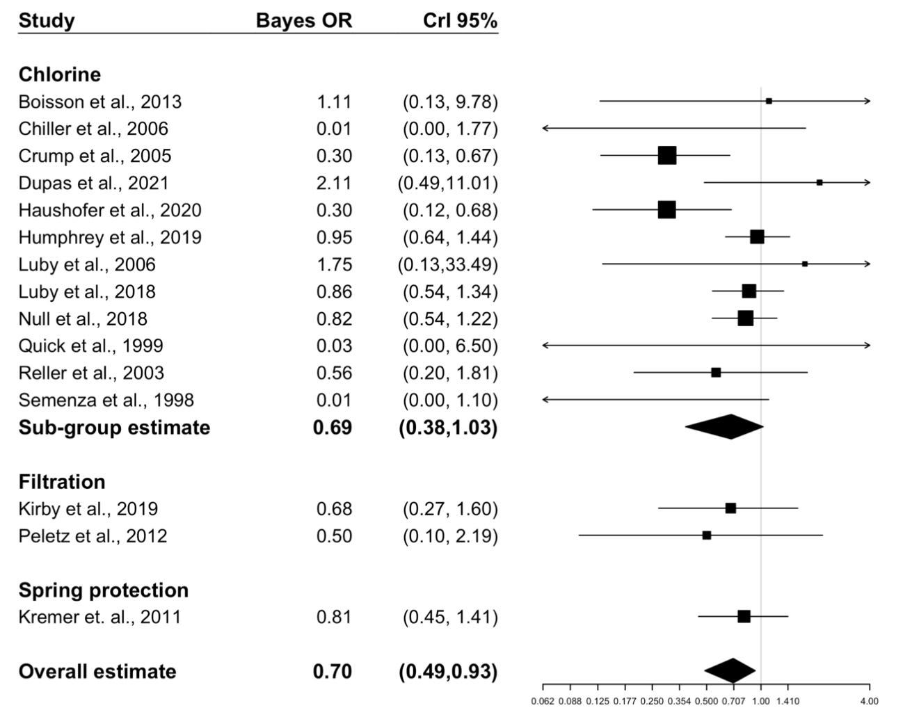
Although there is some uncertainty10 around the precise figure, this was a surprising result to many people.
Using data on the costs of existing programs, the authors also estimated that a scaled-up version would translate to around $2,974 USD per death averted in children under five years old, which would place it among the simplest and cheapest ways to prevent death that people know of.
I want to note something here though, which is that this summarizes the effect across a group of places, treatments and times.
For example, across the trials, an average of 69% of households actually used the clean water treatments, but this ranged from 27–87%.
Another point is that the baseline level of pathogens can vary too. In more developed areas, where pathogens have already been filtered out, the benefits of such a program will be lower. But where basic water and sewage systems are lacking, the benefits of clean water treatment will be large.
Remember that these studies tell us about the results of clean water programs tested within the last 25 years. They show us that even today, our potential for making progress on something as basic as drinking water is very large.
This is one of many reasons why I believe there’s still lots of low-hanging fruit in development. Progress is not just about the frontier with new technology and invention, but also about how much we can do with what we already know, even now.
New Works in Progress
We released a new issue of Works in Progress magazine last week, and it includes many awesome pieces like:
Every grain of rice – on the future of rice biotechnology, by Niko McCarty.
The end of acid rain – on the story of how countries came together to stop acid rain, by Hannah Ritchie.
Why Britain doesn’t build – on the entire history of the UK’s housing crisis, by Samuel Watling.
Thomas Edison, tinkerer – on the great inventor who turned inventions into practical systems, by Eric Gilliam.
Taming the stars – on how to lay the groundwork to build low-cost, safe nuclear energy plants, by John Myers.
How DC densified – on how Washington, DC avoided the housing problems that so many American cities faced, by Emily Hamilton.
Olivine weathering – on a fascinating way to sequester carbon from the sea, and thus from the air, by Campbell Nilsen.
Recommendations
Here are some other things I’ve enjoyed recently that you might like too.
The book The Butchering Art, on the gruesome history of surgery and how it was transformed by Joseph Lister. (I’ve been listening to the audiobook, which is very nice.)
Some incredibly realistic medical anatomy illustrations by Sana Khan.
An eight hour long instrumental playlist to help you work and keep you awake, by me.
Pseudoerasmus once described it as “The Goldilocks allegro ma non troppo instrumental playlist. Not too andante, not too presto or vivace. And not too dissonant.”
The film And the Band Played On, about the discovery of AIDS, how it transmitted, and how it was caused by HIV.
Did you know that credit for the discovery of the cause of AIDS led to fierce legal battles between American and French research teams, and then US President Ronald Reagan and French Prime Minister Jacques Chirac settled terms on who would get credit and patents for it? (It was only later recognised that the French team of Françoise Barré-Sinoussi and Luc Montagnier had identified it quite early on, and they won a Nobel prize for their discovery.)
Two great podcast episodes of Tides of History, on the history of Venice and the Venetian empire. By the way, history podcasts are amazing to listen to while you’re on holiday in the place itself.
Three online textbooks:
Telling Stories with Data – on statistics, programming and communicating data science, by Rohan Alexander
Human Genetic Variation – on computational genetics, by Rajiv McCoy, Stephanie Yan and Kate Weaver
Cell Biology by the Numbers – on the maths of cell biology, by Ron Milo and Rob Phillips
I also loved the post Biology is a burrito, on why thinking about biology in numbers is so important, by Niko McCarty.
And that’s all!
I hope you enjoyed this, learnt something new, shared it with your friends, and subscribed if you haven’t already.
As always, if you spot any errors, please let me know so I can fix them.
Have a great rest of your week! :)
– Saloni
P.S. you might have noticed I’ve switched over this newsletter to a new URL, but it’s still on Substack and all the old links will redirect to the new one.
P.P.S. I’ve been recovering from a cold, so my voice might sound a little stuffy on the audio voiceover.
This is a relative measure – it describes how some families experienced higher child mortality than other families at the time. As the authors explain, the share of women who had a child die has declined over time.
Correction (2 Nov 2023): I found out that the estimates in this paper were actually period estimates, and that I had misdescribed them.
For example, the sentence: ‘It shows that women in France who died at the age of 90 in 1900 were in the top 1% of survivors in their cohort.’ was inaccurate. Rather, it should have said something like: ‘It shows that among those born in 1900, women in France who die at the age of 90 would be in the top 1% of survivors.’
I have now updated several sentences in this section to describe the estimates more accurately. I reread the paper multiple times to make sure I was interpreting it correctly, because I was a little confused at the time, but still I came to the wrong conclusion. I’m sorry about this.
Guinea worm is a disease that used to be common in Africa and South Asia until recent decades, and before that was also common in the Middle East, Russia and Central Asia. In the late 1980s, there were more than 890,000 reported cases worldwide. But last year, there were only 13 and the disease is close to being eradicated. I wrote about how this progress was possible in this article for Our World in Data.
It can often be difficult for researchers to figure out how many people actually used a treatment. In this case, they could do so by adding a powdered reagent to a sample of the households’ drinking water and seeing a colour change. Figure 3 of the paper shows that 20–40% of households in the coupon group had positive chlorine tests over given months of the study.
For an introduction to intention-to-treat analysis, I recommend this review or this explainer video.
There are also other reasons to prefer intention-to-treat analysis. Narrowing down the group to those who actually used the treatment can be done arbitrarily, leaves room open for cherry-picking, and violates the principle of randomization itself – because the people who actually took the treatment might differ in some important ways.
In case you’re interested, another great recent study looked into the economic value of piped water systems in 19th century Chicago.
This includes the trial mentioned just above.
See also this discussion.



"Progress is not just about the frontier with new technology and invention, but also about how much we can do with what we already know, even now" This is *SUCH* an important point! That the biggest successes or failures lie with implementation, logistics, and getting a sizable fraction of the public to ADOPT the intervention is frequently overlooked. A great example is in vaccines: It doesn't matter if we are able to produce highly effective vaccines with new mRNA or other technology if large segments of the public reject advice to take it
Fascinating. My father is a Third World immigrant born in the 1940s. Several of his siblings died during infancy or childhood including his twin, and seven survived into adulthood. I’ve known this from early age, so the childhood mortality information is not so shocking to me. What I never thought of is how many of his friends were still around with him in his 70s and 80s., And how different things would have been if he had reached his age in a different era. How lonely must it have been to be old!