#11: Everything great I've read in the last fortnight
This week: The curve of death, eliminating HIV, the impact of cash donations, lemurs picking their nose, the spread of dumplings, trade, and some cool space photos.
This is my eleventh post of Scientific Discovery, a weekly newsletter where I’ll share great new scientific research that you may have missed. Check out the About page if you’re interested in why I’m writing this.
I’m wrapping up my final PhD project before I submit my thesis, which means I’m going to write less frequently for the next few months. But for now here’s a round up of some great research I’ve read recently and two new articles by me.
The J-shaped curve of death
Study: A Unified Model of Cohort Mortality (Lleras-Muney and Moreau, 2022)
Have you seen this curve before? The black line shows the risk of death as people get older. Let me explain why it has this shape, piece by piece.

First, you can see that infants tend to have a much higher risk of death, compared to children and young adults.
Part of this is likely to have arisen over evolution. As our heads grew larger than other primates, and our pelvis rotated inwards so that we could walk on two feet, this meant giving birth became harder.
This led to an advantage for giving birth earlier during a pregnancy, compared to other similar primates, but it also meant that human babies were born at a time when they were more fragile and vulnerable.

Second, you can see in the chart that the risk of death also rises exponentially as we age. Compared to a 40 year old, the average person aged 60 has 10x their risk of death. The average 80 year old has 100x their risk.
It’s likely this is because our risk accumulates over time: As we age, our organs get damaged – by injury, stress, random mutations, etc. Our hearts beat more erratically, our blood vessels get more clogged, our brains shrink.
This damage makes us more vulnerable to further damage. And to make things worse, our cells become less able to repair it. It’s believed that this leads to a risk that grows exponentially.
This J-shaped curve is seen around the world, and it is sometimes described as the “Gompertz-Makeham Law of Mortality”.1 That name might make you think the risks of dying at those ages are fixed, or simply a fact of life. But they aren't.
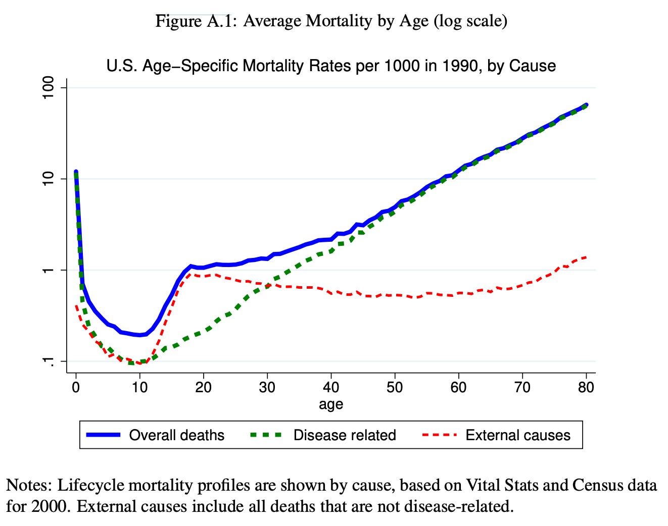
One reason is that weird-looking kink – where adolescents and young adults have a sudden increase in their risk of death. What causes that?
When we pull apart the reasons people die, we can see that the kink comes from a sudden rise in deaths from ‘external causes.’
External causes – which include accidents, drug use and suicide – tend to be more common causes of death in those age groups. They also affect older age groups at similar rates, as you can see, but the risk from diseases begins to dwarf them with age.
Risks from external causes aren’t fixed; they can change. In Greece, for example, deaths from external causes declined by 40% between 2000 and 2009 in adolescents and young adults, mainly because fewer people died from road traffic accidents. In some other places and times, they’ve increased.
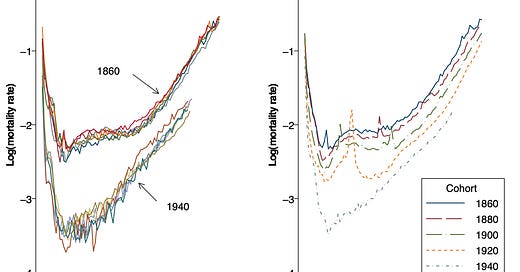
But what's really amazing is that the whole curve has changed over time. This is shown in the chart below, with data from European countries. You can see that the risk of death declined across all age groups.
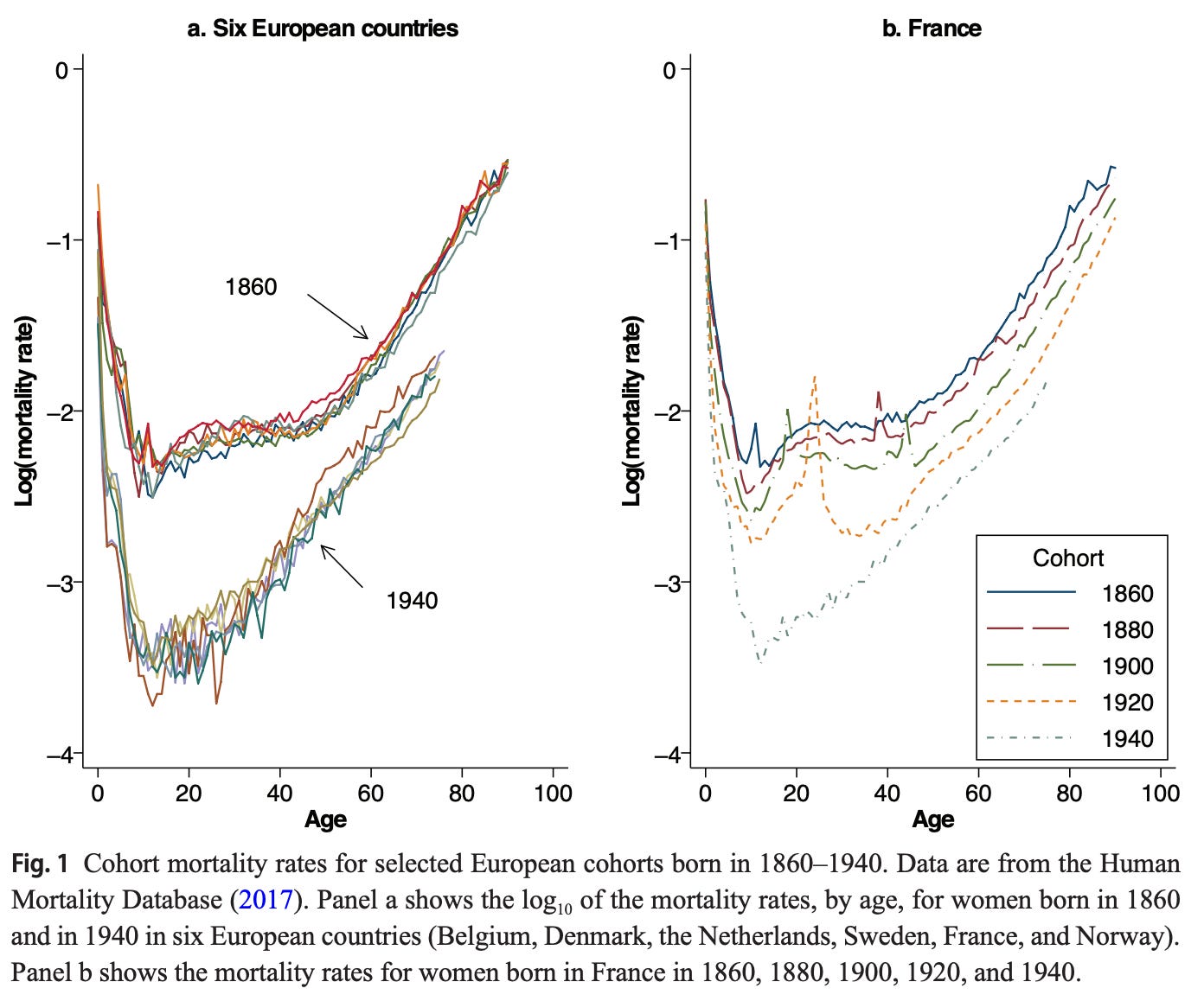
I've occasionally seen people argue that life expectancy has risen only because child mortality has declined. But this chart shows why that isn’t true: people are less likely to die at any age. That’s why we’re living longer and dying later.
My colleague Max Roser has previously written a lot about this topic, and on how much these improvements have varied across the world. But this new study had a very striking chart to show it.
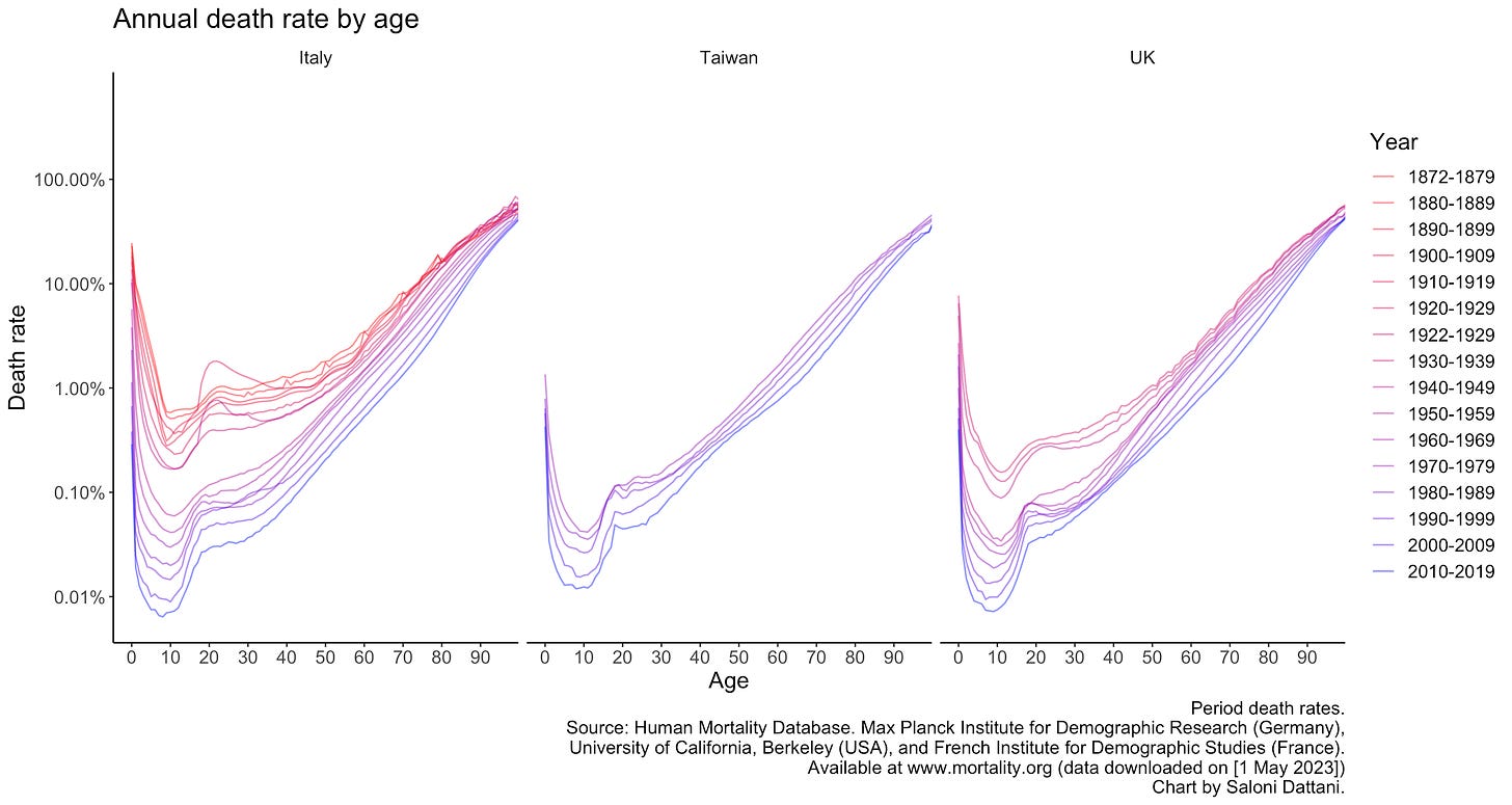
I was interested in what the trends looked like in recent decades, so I made some charts from the data myself.2
I wrote two new articles recently!
The first was for WIRED: ‘The pandemic uncovered ways to speed up science’. In it I explain how scientific research can be sped up without compromising on quality.
Many people believe that there’s a trade-off between speed and quality in research. That is sometimes true. But in the urgency of the pandemic, some scientists found ways to boost both: with routine data, streamlined experiments, division of labour, ‘open source’ science, and new ways to do peer review.
The second was for The Guardian: ‘Should we give people diseases in order to learn how to cure them?’ This piece is about the ethics of human challenge trials, where volunteers are deliberately infected to test new drugs and vaccines.
As I’ve explained before, these trials can be really useful: they save time, especially for diseases that are unpredictable in the general population; they mean fewer volunteers are needed in a trial; and they can monitor volunteers more closely to learn how they respond to the disease.
Obviously, there are also risks and harms from doing these trials.
In the piece, I explain how these trials have already been used for several diseases, including malaria, cholera, pertussis and tuberculosis, where they’ve been made much safer for volunteers.
But what about new diseases or those that still carry big risks for volunteers? Actually, I’ve already said too much – you’ll just have to read it to find out.
Research round up
Here’s a long list of new stuff I’ve read. (A reader commented that this list lurched between different topics too much, so this time I’ve ordered them by topic.)
There’s a new RSV vaccine, given to mothers to reduce disease in newborns, and it’s expected to be available next year. It’s estimated to reduce severe disease from RSV by 82%. That’s great!
As I’ve written before, RSV tends to be severe in infants. It’s estimated to cause around 6% of child deaths from lower respiratory disease worldwide.
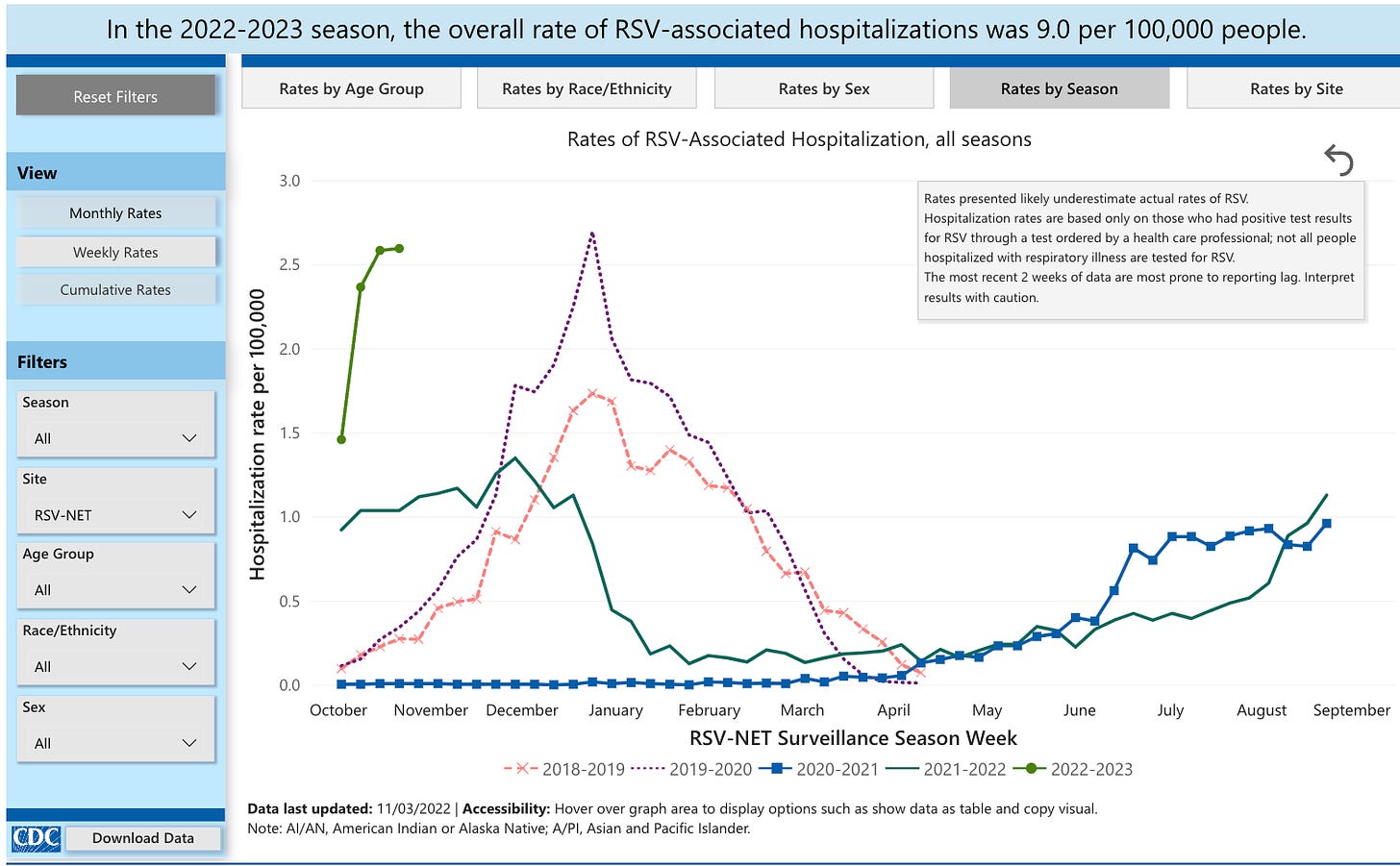
Relatedly, the US CDC now has this new interactive dashboard on RSV, which shows rates of diagnosis and hospitalisations for it: there’s been an early and large surge of RSV and flu this year. (Get a flu shot if you haven’t already!)
The UK is aiming to eliminate HIV transmission by 2030. This chart shows the estimated number of HIV infections among gay and bisexual men: infections have fallen by 71% between 2012 and 2018. That’s huge!

We have a big new Global Health Data Explorer3 on Our World in Data, and it was made by my amazing colleague Fiona Spooner.
You can use it to explore many health metrics: childhood mortality, stunting, pregnancy care, maternal mortality, healthcare spending, life expectancy, vaccination rates, deaths from diseases, fires, homicides, drugs, etc. etc. etc.
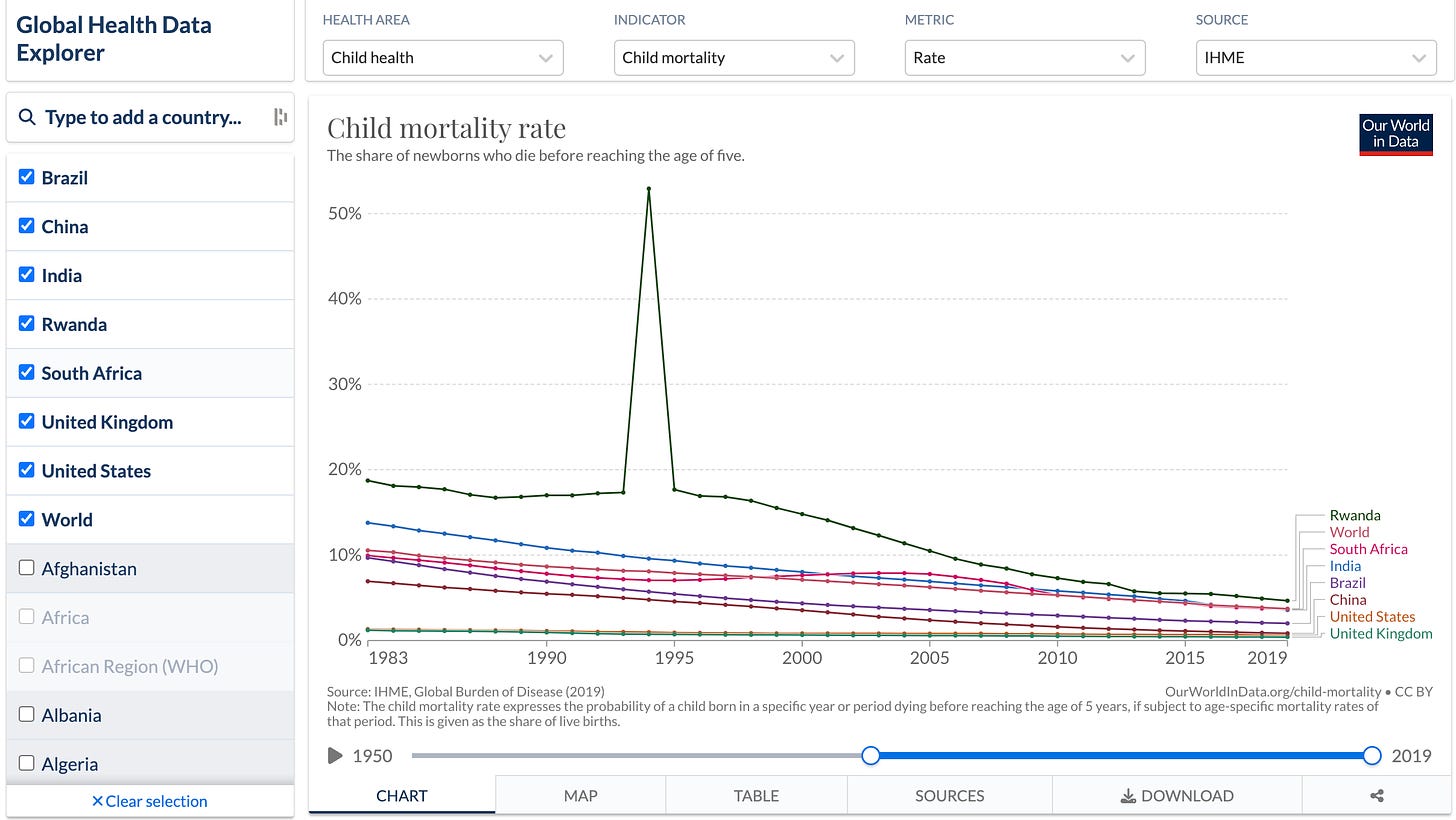
The new Global Health Data Explorer on Our World in Data. One thing I find really interesting about this is that you can spot trends that reflect major events around the world. For example, in this chart, you can see a spike in child mortality in Rwanda, which was just one of many effects of the genocide that unfolded there in 1994. I also spotted some other major events, like the Great Leap Forward, but maybe you will find even more.
Several primate species are known to pick their nose. This new study shows this for the first time in aye-ayes, which are a type of lemur with long fingers. Their middle fingers are so long that they can insert them into their nose and reach all the way to their throat!
I included this diagram because it made me laugh. (The paper also includes a night-vision video.) (Anne-Claire Fabre and Renaud Boistel, 2022)


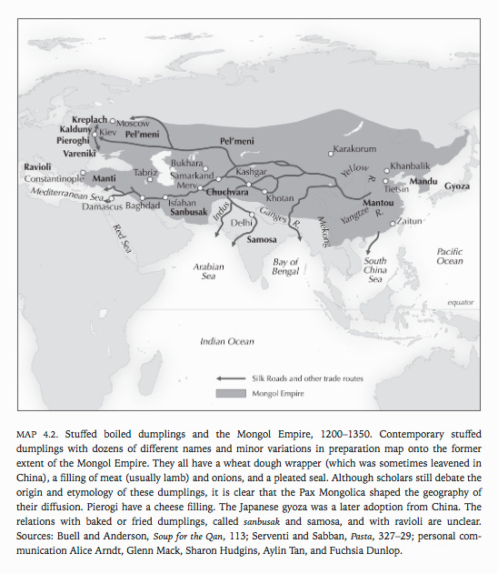
Where do dumplings come from? And how are they connected to samosas, ravioli and gyoza? Here’s a really cool map that explains this. It comes from a fascinating book called ‘Cuisine and Empire’ by Rachel Laudan, who is a historian of science and food.
The author Rachel Laudan has also previously written an article for us at Works in Progress, on the invention of grinding mills and how they freed women from back-breaking labour.
How do cash donations affect people in poor countries? This big RCT involved giving households and villages in Kenya a one-time cash transfer of $1000 USD (which totalled 15% of their GDP), via the charity GiveDirectly.
The authors find large benefits. The cash transfers increased household spending and increased revenue for firms, meant that households held durable assets (which includes many things such as vehicles and furniture) for longer. It didn’t noticeably change labour supply, and caused just a minimal price inflation. The study has many more findings. (Dennis Egger, Johannes Haushofer, Edward Miguel, Paul Niehaus and Michael Walker, 2022)
‘Low-skilled immigration’ boosts the productivity of firms. When this immigration is restricted, jobs don’t tend to be replaced by people already living there – and in rural areas, firms actually tend to hire fewer natives.
This new detailed study shows this using data from the United States, where ‘low-skilled immigrants’ receive visas through a randomized lottery (Michael Clemens & Ethan Lewis, 2022). (See also this Twitter thread by the authors.)
A new study explains why the impact of the WTO and GATT has been underestimated – they had large benefits for non-member countries as well. The authors estimate that ‘membership has increased trade between members by 171%, and trade between member and non-member countries by about 88%’. (Mario Larch, José Antonio Monteiro, Roberta Piermartini and Yoto V. Yotov, 2019)
In the 1950s – when Taiwan was a closed and poor economy facing widespread poverty, rationing and hyper-inflation – its government made a sudden shift to devalue its currency and open up its economy to trade. This led to massive export-led growth and was a huge success. How did it happen? Douglas A Irwin explains in this great podcast episode hosted by Chad P Bown. They’ve also published a report on this here.
Anyway, enough of ‘the world’. Here are some cool space photos I’ve seen recently.


Even more links
Biotechnology is improving rapidly. Is this ‘biology’s century’? Matthew Herper has a great new article about this. (I also recommend Elliot Herschberg’s newsletter Century of Bio on the topic.)
‘What is crypto?’ – a very long but very readable explainer by Matt Levine.
Will Buckner on how the intelligence of hunter-gatherers has been seriously underestimated by some (crank) researchers.
What do we know about prion diseases? This podcast episode with Richard Knight gives a great overview.
The ONS has a really slick new interactive page of data from the UK census, to the level of neighbourhoods.
‘Science has a nasty photoshopping problem’ – this interactive article by Elisabeth Bik shows how some researchers fake images in their studies.
One sleuth, Nick Wise, uncovered so much research fraud that it led to 850 retractions (so far)!
Here are 10 minute checks you can do on data from a study to spot big errors, by Steve Haroz.
David Quammen has a new book called Breathless on how the Covid pandemic emerged. I listened to a podcast episode about it and it sounded awesome – I have a trip coming up soon and plan to read it then.
A great new ‘centralised peer review’ system: researchers who want to publish on neuroscience/cognition/etc. can submit their study as a registered report to a central organisation, where it gets reviewed, and then choose an eligible journal to publish it in. I’ve written about this idea recently.
That’s all for now4 – it’s likely that I’ll be buried in work for a while as I finish working on my thesis, but hopefully not for too long.
I hope you enjoyed this week’s post, learnt some cool stuff, shared it with your friends, and subscribed if you hadn’t already!
See you next time :)
– Saloni
By the way, you can now also find me on Mastodon at @[email protected]. I really hope Twitter doesn’t become unbearable, but I’m also on Mastodon as a backup and to keep up with my academic friends.
This paper has a good explanation of how this discovery changed our understanding of mortality.
Updated: I added this paragraph and chart on 1st May 2023.
Please get in touch by email if you see any bugs/errors!
As always, please let me know if you spot any errors in this post or notice that I’ve missed something important.



Excellent curating—thanks!
Happy dissertating! <3